
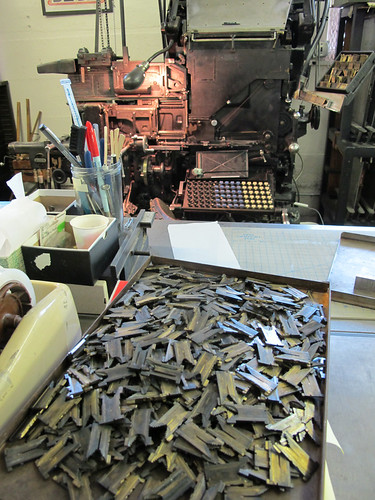
Wednesday, October 10, 2012
Notes to self: inventory mats before running
Tonight I tried running new-to-me mats. I have a better idea of how many mats fit in a half magazine, because I discovered that I had way too many. I bet there is a lower case "e" count that would allow one to quickly determine if there are too many mats to fit. So, self, check it out. Also, please inventory mats before taking the time to load them into a magazine. After what appeared to be a full font, I discovered I only have one "." This is a problem. Anyway. Always learning. But never seem to learn that you can never have enough patience for this machine.
Linotype Pie
Minutes before our open house for Portland Design Week 2012, we had a little issue with a magazine. Yup. Wasn't pretty. But, we managed to clear the pi(e) and demonstrate the linotype machine using another font. No matrices were damaged during this demonstration. I hope.
Monday, October 1, 2012
Identifying Linotype Spacebands

The spacebands that I have here at the shop are 4 lines. I assumed that the number of identifying lines marked in the side of the spaceband correspond with the thickness of the space. Nope. I was wrong. The breakdown is below. Info from "Linotype Keyboard Operation" book.
One Line: Thick
Minimum .0375
Maximum .1035
For Normal spacing of medium size faces where close spacing is not required.
Two Lines: Extra Thin
Minimum .028
Maximum .0943
For close spacing. Recommended for offices doing good book and job work and those using small faces.
Three Lines: Extra Thick
Minimum .046
Maximum .146
Used only for large display faces where wide spacing is required.
Four Lines: Special Taper
Minimum .0369
Maximum .1219
Similar to the wide range (see below) but a little thicker at both minimum and maximum points.
Five Lines: Wide Range
Minimum .0345
Maximum .1194
Gives extreme flexibility of spacing. Thin enough for close spacing, with ample range of expansion for wide spacing.
Trust the spacebands....
Below is a scan of a proof of some lines cast this past weekend for a friend. 8pt Linotype Paragon set on 23 pica line, regular justification. I let the space bands do their work, and wanted to learn their tolerances and get used to how a line would space out according to how many spaces bands were used vs. word size, etc. I figured this face could handle some "gappy" word spaces, but I was surprised at how this composition appears fairly consistent. Even though there are some lines with ambitious word spacing, none of them stand out as being too obnoxious with noticeable "holes" or "rivers" in the composition.
What I learned: generally speaking, space bands have a "spread" of 3 pts, so if you have at least 5 space bands in a line, they will easily take up a pica worth of space. I'll add a separate post which will describe the markings and different thickness of Linotype spacebands.
Another thing I was reminded of after setting these lines are the rules for indentation. For commercial work, the rule of thumb is to indent paragraphs by an em for lines set up to 20 picas. 1.5 ems for lines up to 25 picas, and 2 ems for lines above 25 picas. Of course depending on type size, leading, etc. there are exceptions. But after looking at the paragraphs I set below, I think my 2 em indentations are a bit too aggressive. I referenced the book "Linotype Keyboard Operation" for the refresher.

Oh, after clicking on this photo to take a closer look, I noticed something else. See the lower case "i" with a problem? I'll have to run the mats out and have a look at them.
Subscribe to:
Posts (Atom)